Harper College Fashion Department
Ad Campaign Design | Voted Favorite Design

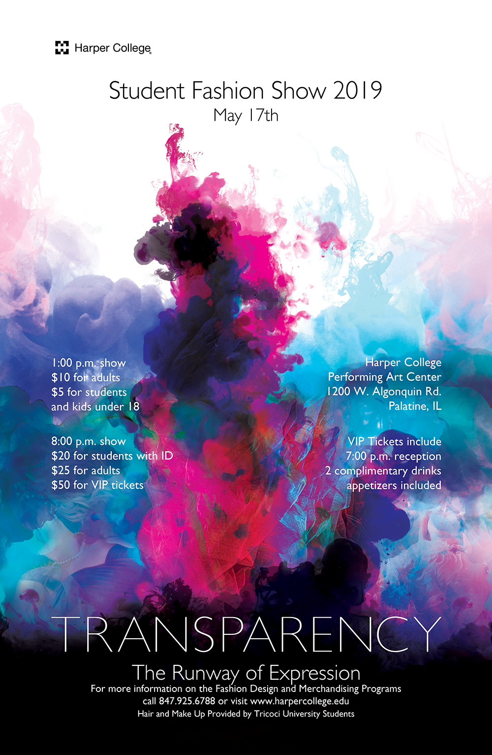
Brief: The Harper College Fashion Department needed an evocative design that expressed the idea of "Transparency" via fashion and clothing as effectively as possible while laying out the information for the event clearly and concisely for print on large posters down to small bookmarks.
Context: Every year Harper College holds a spring fashion show for students to showcase their work. This event is a way for students to show their work and having a larger audience is key to helping talented fashion designers find jobs

Fashionable while not literally OF FASHION
Layers of meaning with Energy
Simple yet Evocative

IDEATION
While talking with the clients the idea of transparency was made clear: Revealing truth, seeing through to the heart of creativity, and layering elements to enhance and define them further. With that in mind I sketched a variety of compositions. Thinking of a variety of directions which could be explored. Many of these ideas had to do with water, ice, wind, and how ideas and concepts can be fluid, changing, and powerful.

Font Choice
While the project needed to be easily read and displayed at a variety of sizes, the emphasis on fashion and the tasteful qualities of fashion led me toward a classic but modern feeling font. Because of this Futura seemed like a natural choice. This would allow for the students work to be perceived as current and professional when presented to recruiters hiring at the show.
Evocative Imagery
The imagery of the final piece, pictured below, was a complex fusion of liquid, ink, and brushes, mixed and blended to create a detailed flowing image that feels kinetic and direct while being subtle and intricate.

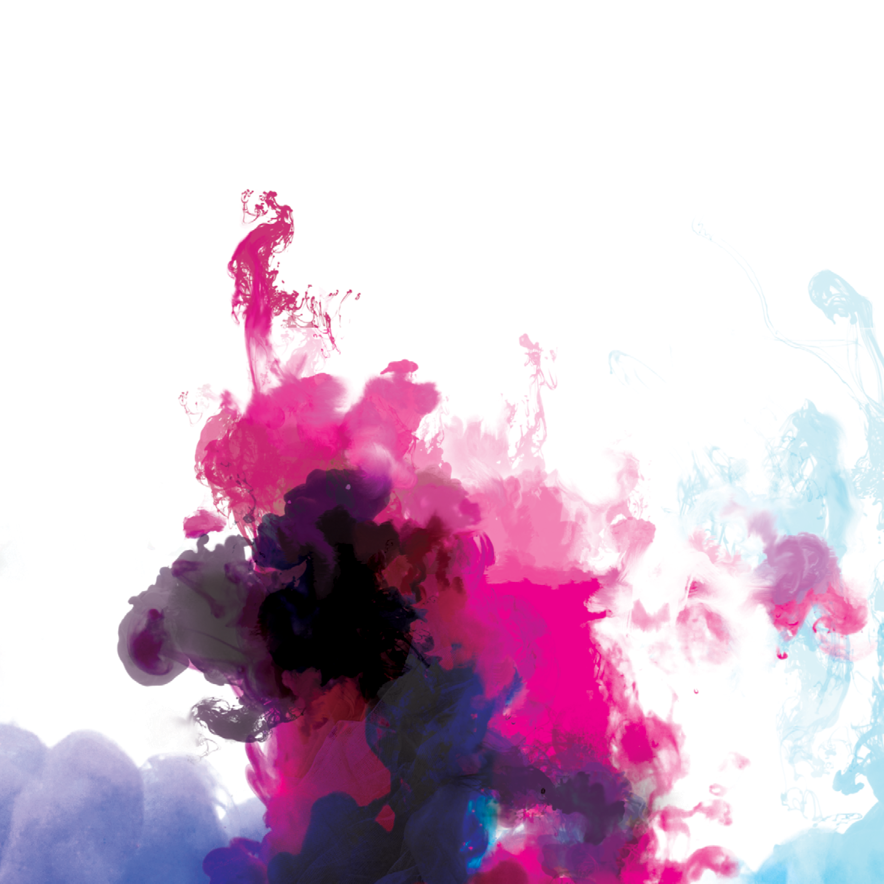
Design Closeup 1
In my process I used photoshop to layer and blend multiple images of ink in water and by recoloring and using filters along with multiple custom ink brushes I was able to create brilliant and realistic image for the poster design.

Design Closeup 2
I layered in photographs of fashion models and cloth to give the water the feeling of fabric being dunked in water and dye spilling with it. The figures I integrated were able to give more form and direction to the piece, informing the audience of the topic of the poster.

Design Closeup 3
More samples of using figures to express the fashion and “fabric in water” feel I was going for. The brilliant colors I was able to generate were owed to clever use of multiple layer filters in photoshop along with manipulation of the photos levels and saturation. I was careful to not blow-out the colors of the photos to maintain a coherent and pleasing image.
Building the Advertising Campaign
I was tasked with taking the initial poster design and using it as a guide for the rest of the print collateral for the project. This was an interesting challenge and allowed for me to really fine-tune the design leading to minor revisions and iteration that helped bring the final design together by the end of the project.


